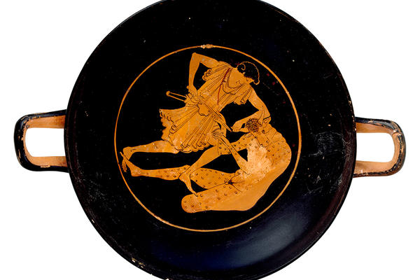
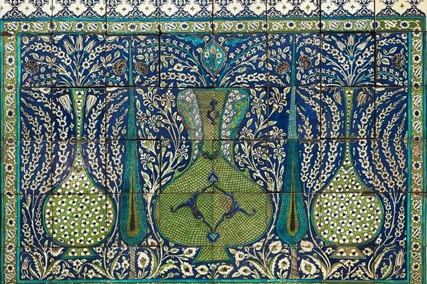
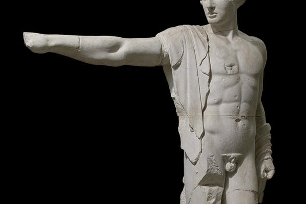
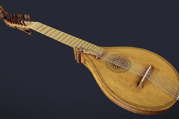
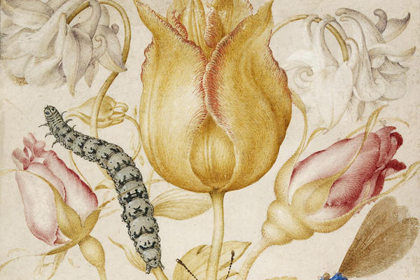
The Ashmolean's world-famous collections range from Egyptian mummies and classical scupture to Pre-Raphaelite paintings and contemporary art. We continually add to and update our online collection records.
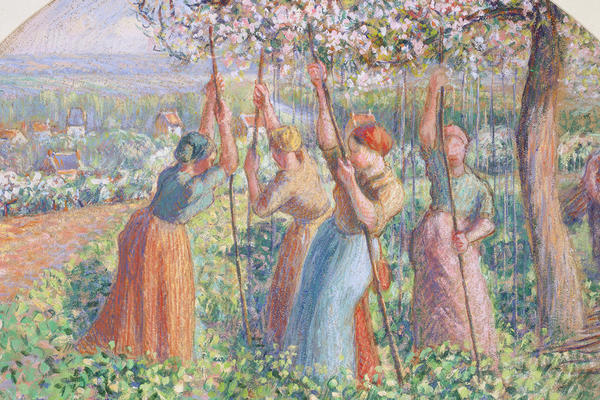
Enjoy paintings, drawings and prints by Camille Pissarro (1830–1903), one of the most celebrated artists of 19th-century France and a central figure in Impressionism.
Search our extensive online collections to discover objects and artworks from across the world and time, and delve into some of our collection highlights.